A mobile-first system that helps residents access services, spaces, and information more independently.
Role: Communication & Information Design
Scope: UX, UI, System Design
Context: Refugee Housing Facility (Berlin TXL)
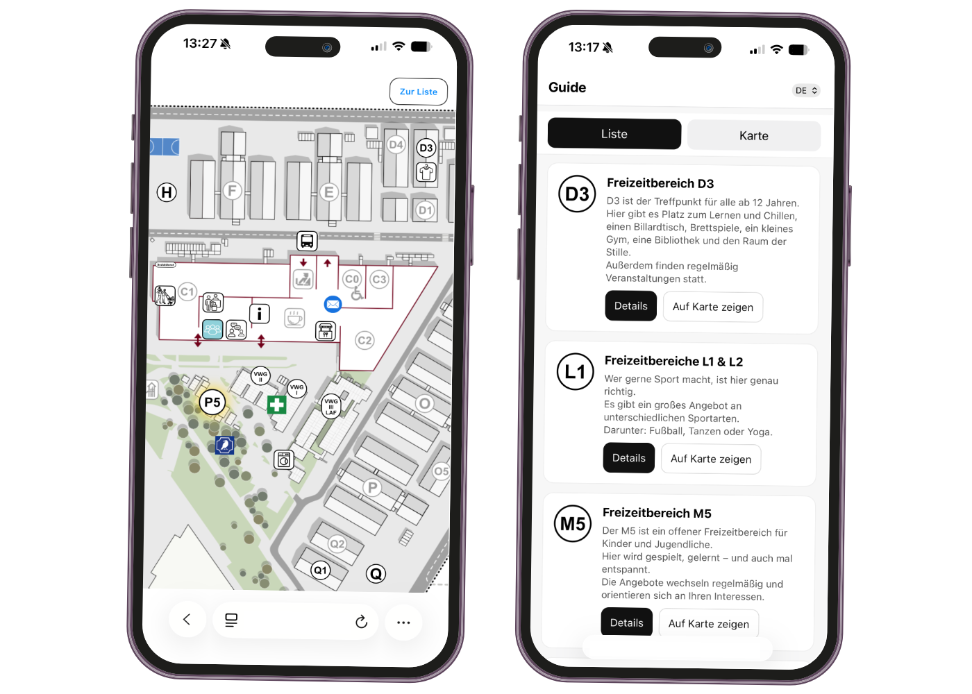
The facility operated like a small city, with services, programs, and support offers changing every week.
After the outbreak of the war in Ukraine, Berlin had to rapidly expand accommodation and support structures for arriving refugees. The former airport site in Tegel became a large, complex environment with many services, providers, and daily programs spread across the site.
Information existed, but it was distributed across notice boards, printed schedules, verbal communication, and staff support. This made it difficult for residents to understand what was available, where to go, and when services were open.
The core problem was not missing information — it was the lack of a clear system to access it.
Residents had to search across multiple physical sources, understand changing schedules, and often ask staff for basic orientation. For people arriving in a new environment, this created unnecessary dependency and confusion.
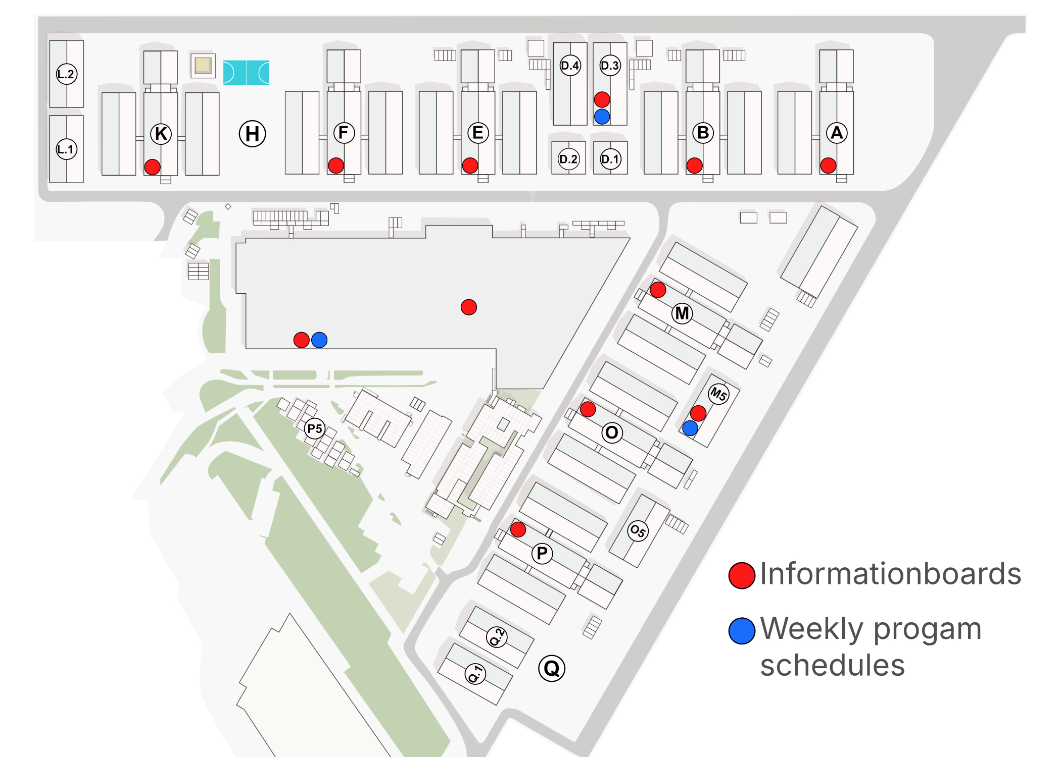
1. Scattered Information
Services, schedules, and announcements were distributed across different boards, flyers, and locations.
2. Hard to scan
Information changed frequently and had to exist in multiple languages, making it difficult to keep content clear and consistent.
3. Dependency on staff
Residents often needed help to find basic information, instead of being able to navigate the site independently.
The first version focused on spatial orientation.
I translated the site into an interactive map that allowed residents to explore locations visually and access relevant information directly from each point. Each location followed the same content structure: opening hours, description, links, and language-specific information.
This made the physical environment easier to understand and reduced the need to search across scattered notice boards.

The interactive map improved access at specific information points, but it did not fully solve the broader access problem. Residents still needed to be physically near the map to use it, and not every information need started with a location.
Some users were not asking “Where is this place?” — they were asking “What support is available for me?” or “What can I do today?”
To make information accessible anytime, the map logic was extended into a mobile interface.
I developed a mobile-first platform that combined spatial navigation with structured service access. Instead of only browsing the site through a map, users could also explore services through categories, lists, filters, and multilingual content.
This turned the system from a fixed orientation tool into an everyday access point for residents.
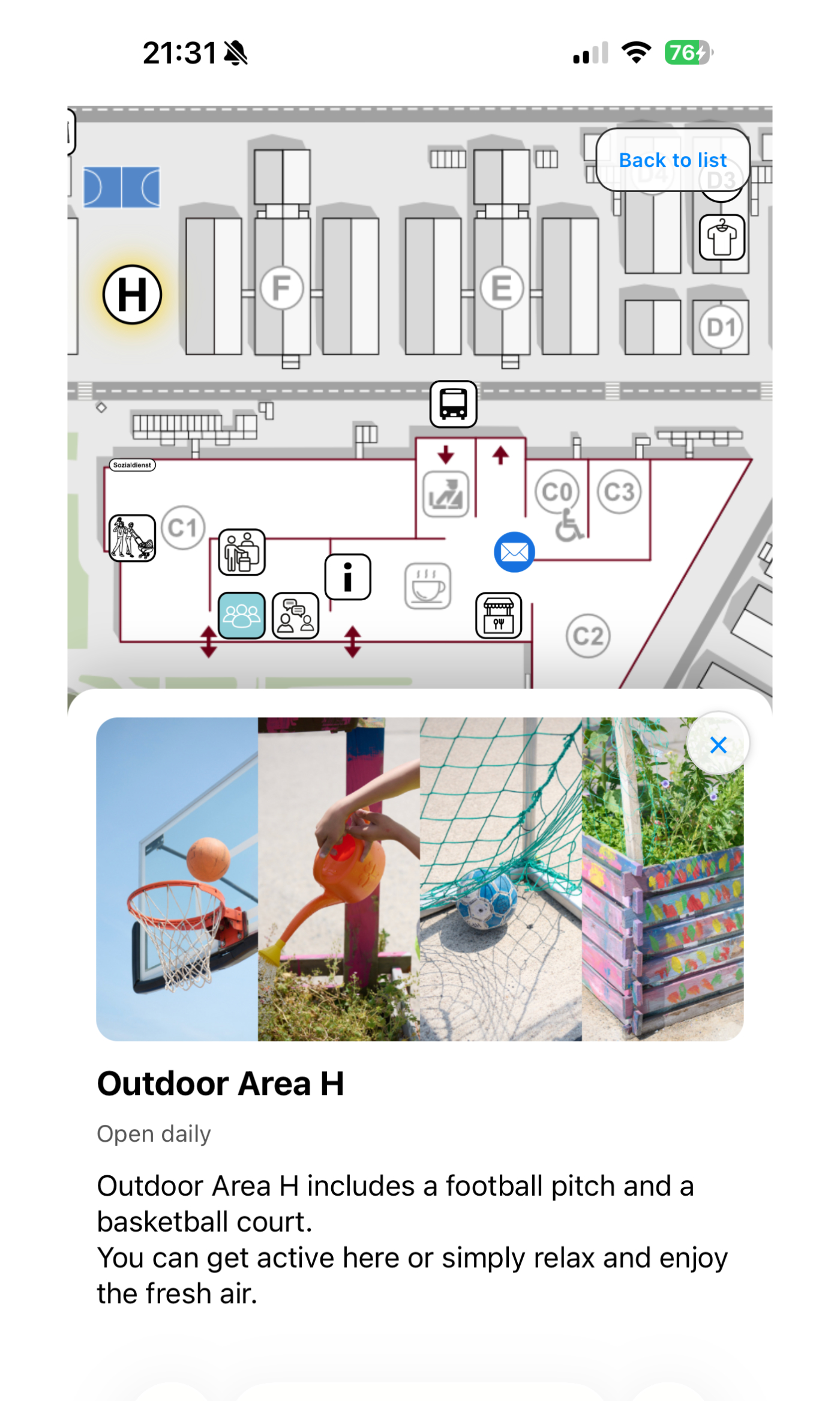
Users can explore the site visually and understand where services are located.
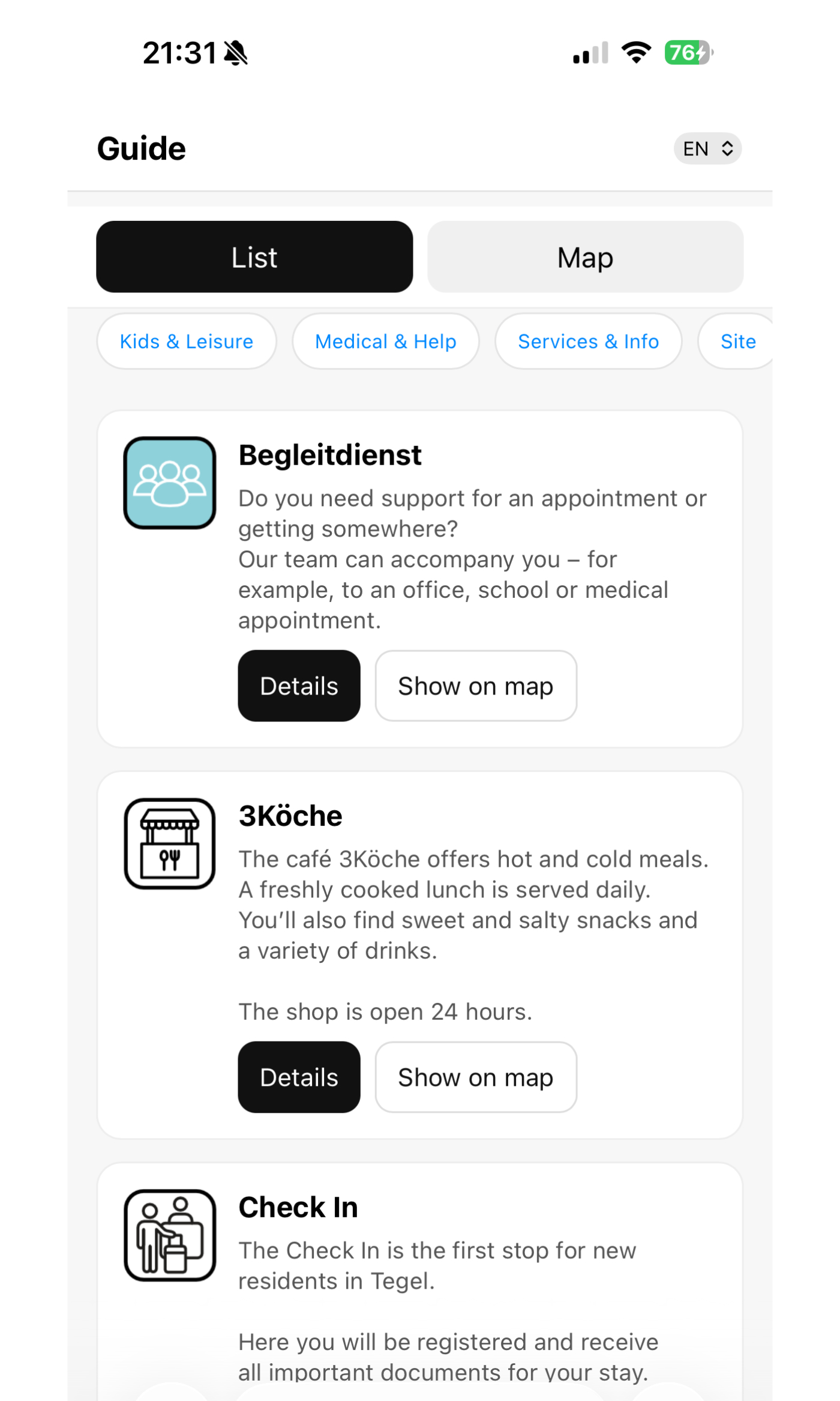
Services are organized into clear categories, making it easier to browse, compare, and find relevant support.
Users can switch languages without losing context, so the same information stays accessible across different language needs.
Each location or service follows the same structure: title, opening hours, description, links, and map connection.
The platform was built around three decisions: centralizing information, connecting content to physical places, and making access independent from staff availability.
1. Create one central source of information
I brought scattered schedules, services, and location-based information into one interface to reduce the need to search across multiple sources.
2. Connect services to places
Each piece of information was linked to a physical location, helping users understand not only what was available, but also where to go.
3. Design for independent access
The interface was designed to work without staff mediation, allowing residents to find information in their own language and at their own pace.
The navigation system created one clear access point for information that had previously been scattered across different places, formats, and languages.It helped staff and residents find relevant services more easily, reduced the need to explain the same information repeatedly, and made updates easier to manage in a fast-changing environment. The system became a practical part of daily operations, used consistently by staff and residents to support clearer orientation within the facility.
1. Accessibility
Information is only useful when people can find, understand, and act on it.
2. Digital systems must reflect real environments
The platform had to connect services, places, and changing schedules instead of treating content as static pages.
3. Accessibility is not only translation
Multilingual access only works when the underlying structure is clear, consistent, and easy to scan.